

Tuesday, 27 March 2012
Photo Planning Table Two
This is my second photo planning table for my final cuts, this is for the replacement images for the ones i decided to take out of my rough cuts.

Friday, 23 March 2012
Diary Entry Six-Friday 23rd March
Tuesday was the deadline for my rough cuts and i was ready for this by Monday, giving me extra time to change minor faults. I also got feedback from my teacher and peers this week on my rough cuts which have really helped me discover what i need to change in order to create the most professional magazine possible. After receiving my feedback i created a table presenting the results and stating how and why i will improve my magazine to utilise my feedback into my work.
Thursday, 22 March 2012
Feedback From Rough Cuts
Feedback from Rough Cuts
Like Could Be Improved
Teacher Feedback
Front
Cover- The stories and layout. Photo-use one that doesn’t need cuttingContents- Layout. Make all fonts uniform
Double Page Spread- Layout. Odd photo
Peer Feedback
Peer One
Front
Cover- Layout.
Title. Different picture. Change ‘World Exclusive’-
use a different colour or font. Don’t like the black writing against hair
Contents
Page- Images. Layout. Too much space. Too
much serif font. Maybe another pictureDouble Page Spread- Layout. Image. Edit picture. Too much red-question to black. Quote red
Peer Two
Front
Cover- Like layout, fonts and sizes. Change background colour and picture
Contents
Page- Like pictures. Change fonts-make more interesting. Use bigger titles. Too slanted
photo of Joe. Double Page Spread- Like picture, effect on the picture and layout. Add caption to picture, Write info on who wrote article and about C.D
Peer Three
Front
Cover-Like layout, union jack circle and barcode.
Change photo and font on Katie.
Contents
Page- Like all of it. Change logo.Double Page Spread- Like picture. Change shorten questions and edit picture.
Peer Four
Front Cover- Like the model-fits magazine genre. Change the image, more features.
Contents Page- Like colour scheme. More pictures
Double Page Spread- Like picture. Add another photo, add captions.
How i will improve my magazine using these comments
From the comments i have recieved i have noticed that the majority of people like the layout of each of the pages in my magazine, mainly the cover and double page spread, so i think that i will try and keep that mostly the same. For the front cover most people have said to use a different picture, i agree with this statement and will therefore be taking a different image that has more natural light and doesn't need cutting. For my contents page people commented on the images, the space and the un-tidiness of the text. I again agree with each of these and will aim to change one of the images to add variety, add more features and text to fill in the space and re-arrange the text. The comments for my double page spread were mostly positive apart from people suggesting captions for the image and for the image to be edited, so i will therefore be editing the image more to appeal to my target audience also.
From the comments i have recieved i have noticed that the majority of people like the layout of each of the pages in my magazine, mainly the cover and double page spread, so i think that i will try and keep that mostly the same. For the front cover most people have said to use a different picture, i agree with this statement and will therefore be taking a different image that has more natural light and doesn't need cutting. For my contents page people commented on the images, the space and the un-tidiness of the text. I again agree with each of these and will aim to change one of the images to add variety, add more features and text to fill in the space and re-arrange the text. The comments for my double page spread were mostly positive apart from people suggesting captions for the image and for the image to be edited, so i will therefore be editing the image more to appeal to my target audience also.
Double Page Spread Rough Cut Audience Feedback
Like- Fade between image and text
-Quote
-Colour scheme of question and answers
Change- Make top bar smaller or change the colour
-Fill in the gap at the bottom with details on her album for promotion
Contents Page Rough Cut Audience Feedback
This video features two of my target audience explaining what they like and what they would change about my contents page rough cut. Feedback includes:
Like- Main image
-Numbers on images
-Similarities to style model, Q
Change- Structure the left hand side text and more text could be added
-Enlarge the title of the page
Front Cover Rough Cut Audience Feedback
This video features two of my target audience explaining what they like and what they would change about my front cover rough cut. Feedback includes:
Like- Block cover stories along the side
-Name of the magazine
Change- Outline cover stories to make them stand out more
-Fill in the space on the right hand side
Tuesday, 20 March 2012
Double-Page Spread Rough Cut

This is my Double Page Spread rough cut. I really like this page as the style and vibe i wanted to create comes across well on here. I think i will change a few minor problems in order to make this perfect for my final cut such as the bar along the top and more editing of the image.
Contents Page Rough Cut

This is my Contents Page rough cut. I again like the layout of this page however i think that there are far too many gaps and that will therefore be my focus to improve for my final cut.
Front Cover Rough Cut

This is my Front Cover rough cut. I am pleased with the layout of my cover however i will be changing the main image for my final cut as i dont like the makeup or how i had to cut around the model. Apart from the image i am happy with this and in order to improve this for my final cut i think i will move the text around to fill the page and also change the large 'katie' as i think that looks ammature.
Tuesday, 6 March 2012
Original Images For Rough Cuts


This image is for my contents page. I like this image esspecially because of the studio lighting and the movement that the drumsticks have created. However i may also change this for my final cut as my other image is stronger for my contents page and they are both on a studio/blank background and i would like to have more differentiation within my magazine when it comes to images.

This is my main image for my contents page. I really like this image and think i will keep this image for my final cut also, partly due to the model's hair flowing down the right hand side and the use of a partial over the shoulder shot.

This is my image for my double page spread. I love this image, with the props of the lampost and trilby against the brick wall. This creates the exact feel i wanted for my double page spread, however i think i may edit this to be flipped horizontally so that it's as if the model is leaning on the left hand side of my double page spread.
Monday, 5 March 2012
Diary Entry Five-Monday 5th March
This weekend I followed my photo planning table and took my photos on Saturday. They all worked out how i had planned however, I am still unsure on how the main image for my front cover looks along with the rest of the design. With my pictures all included in my template on InDesign now my magazine is starting to come together in time for my rough cut deadline. After looking closely at the conventions of music magazines, especially Q, my magazine is now beginning to fit in closely with Q's style and genre.
Friday, 2 March 2012
Photo Planning Table
This is my photo planning sheet which i have created to help me plan for taking my images, this will keep me organised and ensure i capture the exact image i need for each page.

Location Description
Location One-Blank white wall in room. I decided to use this as my location for my front cover image as it features a plain white blank painted wall so therefore is a basic background perfect for a close up or mid-shot image. I also decided on this location as it is directly facing a window which provides a lot of natural light, making my images have natural lighting rather than the simple camera flash.
Location Two-Brick wall in a backstreet of Tynemouth. I decided to use this as the location for taking my double page spread photos as it represented the artist and connected with the style and genre of my magazine. The brick wall and the base of the lamppost created an urban vibe and allowed the audience to get a bit more information about the artist just from the location. This location also fitted well with the layout of my double page spread as the artist was going to be on the left hand side then a gradual fade into the text and this effect worked really well with the fade of the rugged bricks.
Location Three-School stage. This location was chosen for my contents page image as i thought that the staging equiptment would be a good prop for the artist to either stand infront of or sit on it. This incorporated well with the prop of the drumsticks in this image also, creating a rock and roll feel for the particular artist. The staging and dark lighting could also insinuate that the image was taken back stage of a gig making my images more realistic to the music industry.
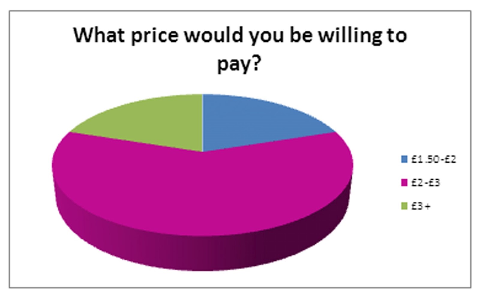
Audience Research-Questionnaire Results
.jpg)


Half of my target audience prefer question and answer format articles and others include new bands and life stories. For my article i will therefore look to create an article in a question and answer format with a feature of my newly created artist being relitavely new to the music industry. By doing this i would hope that it would draw my readers in and excite them about my magazine, as does my style model Q.

My audience had a variety of different ideas on what would make them buy one magazine over the other so i will therefore try and incorporate as many as possible into my magazine, whilst still keeping my style that i am aiming for. Although two of my audience said they'd prefer 'freebies' and 'gifts' i don't think i will include these as i want to keep the sophisticated and classy style that Q magazine has, of which rarely gives out free things. However i am going to leave this thought open to decide at a later date what looks best as my magazine is forming.
Audience Research-Questionnaire

This is a copy of the questionnaire i gave to my target audience in order to find out exactly what they look for in a music magazine. These results will therefore help me to design and create my magazine to cater for my audience.
Subscribe to:
Comments (Atom)